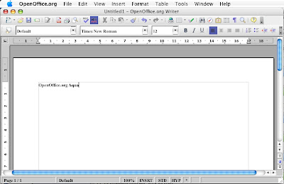
Today I thought I would give you a sneak peek at the upcoming OpenOffice.org Aqua. I have 2 quick screenshots for you.
First up is the OpenOffice.org Writer window after resizing, with a native Mac menu bar.
 |
| From OpenOffice.or… |
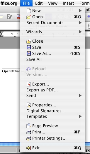
Second is a menu. You can currently use both cmd or ctrl to activate the menu command shortcuts. There is no native file picker yet, but it is a work in progress.
 |
| From OpenOffice.or… |
🙂
Icons in mac menus are pretty much unheard of, especially given the way that they prevent the menu items lining up with each other. If you could get rid of those, it would look a lot better.
Oh, and it should be ‘Quit’, not ‘Exit’, and it should be under the App menu rather than the File menu.
Other than that, looks good 🙂
Looks nice! (In an office application way, that is. All office applications looks booooring. 😉
Icon menus doesn’t disturb me at all. But “Exit” needs to be renamed to “Quit” and more importantly moved to the application menu, just as alblue mentions.
The icons in the menus, while unconventional, are OK because they give the user clues as to which toolbar buttons execute the menu bar commands.
But I would suggest positioning them on the right, beside the keyboard shortcuts, so that the menu items line up.
(And for that matter, I would suggest a user preference to show or hide them).
Nice stuff!
Please see http://www.openoffice.org/issues/show_bug.cgi?id=77595 for more information about icons in menus. There is currently an option for them in ooo. Also icons are able to be in menus according to the Apple HIG.
You can remove the icons in the menu items – it’s in preferences:
OpenOffice.org > view > Show icons in menu (checkbox)
The icons are not shown by default now.
Hmm… It seems that “add a new preference” is a rather over-used response to being asked to make a decision. In my opinion, they should just not have the icons there, and no preference to enable them; they don’t really add enough to make up for what they take away, in terms of making the menu look non-standard.